May 31st, 2018
6/5/2018
Below is my Day 3 challenge: Not Yet Meeting. In my design I chose to use being on hold as a not yet meeting service. 
May 29th, 2018
5/31/2018
Below is my Day 2 challenge: What does the sound of music look like? 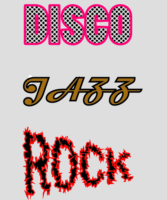 May 10th, 2018
5/15/2018
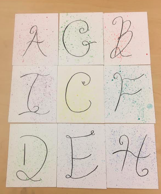 Above is my 36 days of type project. I decided to do the same font style for all of my letters and differentiate them by splattering different coloured paint on them. I loved splatter painting white over my Innovation project so I wanted to do this again and I think it turned out quite well. If I could redo this project I'd try different font styles aside from just the cursive writing however, I really liked the splatter paint on this piece.
February 27th, 2018
2/27/2018
Above is my redesigned Baskin Robbins logo. I think I updated this logo by making it look more modern with a new font and style. I also chose to highlight the '31' part of the Baskin Robbins logo, as it has been done in the past. I am very happy with these decisions. However, I chose to keep the same colours of the Baskin Robbins logo which I think make it look childlike. These childlike colours do not mix well with my new modern design. The logo does not directly appeal to either families or sophisticated ice cream lovers but, it is a mix of both. I think next time I should choose my audience and specifically channel the entire logo towards them.
February 15th, 2018
2/15/2018
Th Nike Logo is a very recognizable and iconic. The second logo creates a bad overall image. The third logo is very confusing and difficult to understand and read. 'The Detail Doctor' logo is not detailed at all.
February 8th, 2018
2/8/2018
 Above is my finished pen tool design of my hand lettering project. This was a difficult project because the pen tool is very tedious and at times, difficult to work with, especially while doing cursive writing for the 'in a' part. I think I stayed quite safe in this project because I did mostly straight lines. I could for sure improve on taking more risks next time by doing more curves; this would also help me get used to using the pen tool. I used my time very well in this project by coming in when I knew I would be missing class and staying on top of my work. I also think the colours and images around my 'Cuddle in a Cup' design have a wintery feeling, which is exactly what I was going for. Despite the challenges, I thoroughly enjoyed this project.
January 29th, 2018
1/29/2018
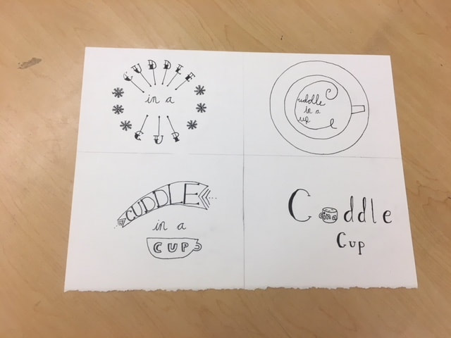 Above is a mini project I did with hand lettering using the slogan 'Cuddle in a Cup.' I really enjoyed this project because I got to imagine different ways to write the same phrase. I think I put lots of thought and effort into making 4 ways to write 'Cuddle in a Cup' however, this took a long time and I missed a class due to basketball. Next time I should improve by recognizing I will be missing class and coming in during lunch to ensure I finish my project on time. Looking back I also realized I cursively wrote 'in a' in 3/4 of my designs. I loved the way my cursive 'in a' looked however, I wish I tried different designs. My favourite design is the top left one.
December 14th, 2017
12/14/2017
Below is a link to a video I took during the Introspection Art Show. This was a fantastic experience where I got the opportunity to see my work on display with my peers work. I really enjoyed the whole process of making my personal narrative project and I'm very pleased with how it all came together at the art show.
|